Brief
Redesign the "Papelería de las Ofertas" website to create a user-centered platform that enhances the overall experience for visitors and increases the conversion rate.
Contribution
Desk Research, User Research, User Interview, Empathy Map, Brainstorming, Screenflow & Wireframes.
Timeline
4 weeks
Tools
Figma & FigJam.
Research: Benchmarking & UX Diagnosis.
As a first approach, I analyzed several top e-commerce platforms to establish best practice benchmarks. Additionally, I conducted interviews to gain a deep understanding of the website's current user experience.
✦ Benchmarking: Best practices in E-commerce
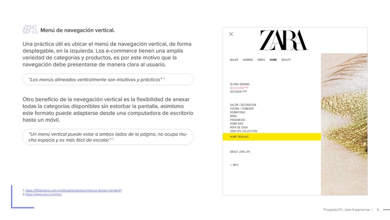
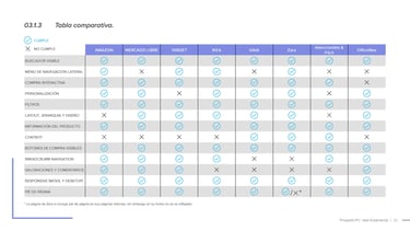
Eight websites were picked and reviewed for their importance in e-commerce sector, their focus on user experience, and their purchasing process.
✦ UX Diagnosis
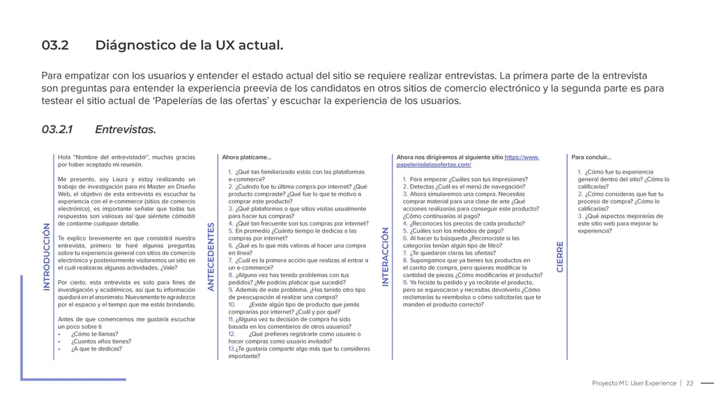
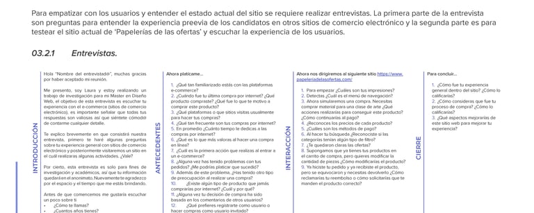
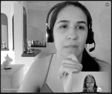
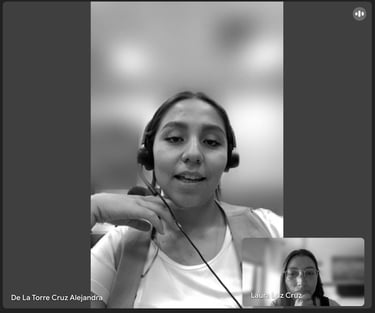
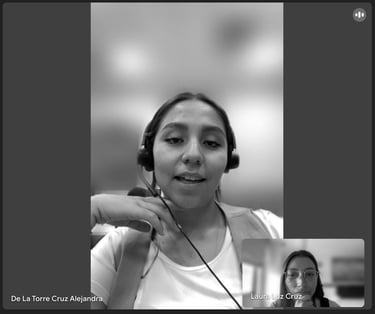
After the competition analysis, I created a script and conducted five interviews to evaluate the current website's user experience.
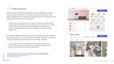
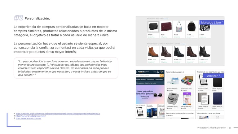
From this research, I extracted 12 of the most valuable practices for redesigning the "Papelería de las Ofertas".
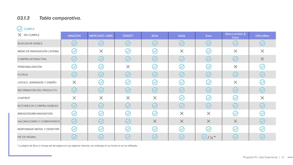
Finally, with the gathered info, I made a comparison chart to summarize similar elements from these websites that improve the shopping experience.
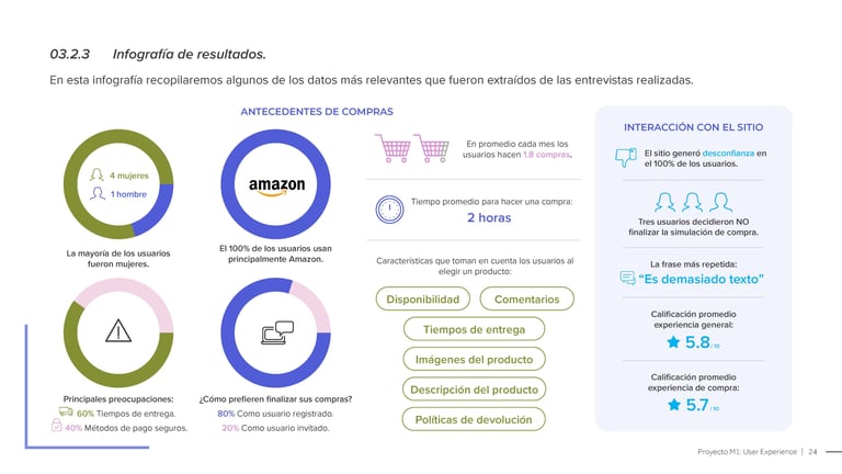
The interview began gathering information about users' experiences with e-commerce websites. After that, I created an infographic summarizing the most important findings.
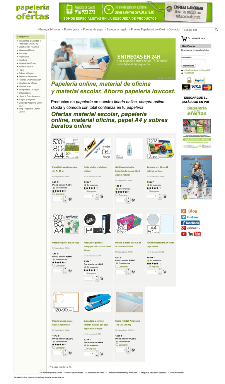
The second part of the interview involved testing the website. During this process, the interviewees completed three tasks. Here are some comments from the interviewees who evaluated the home page:
Home Page
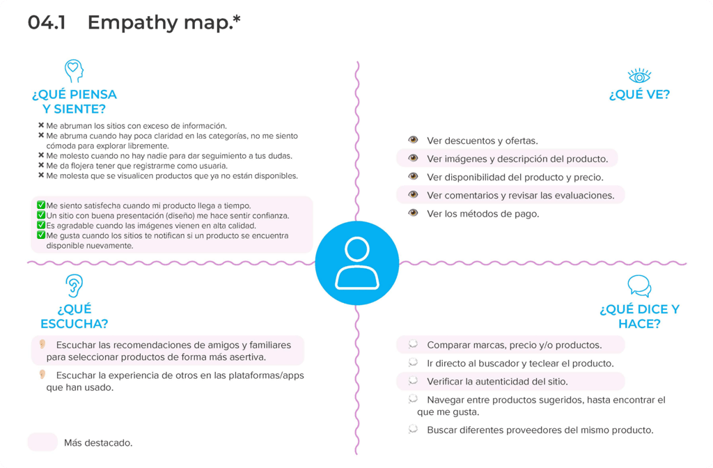
User Needs: Empathy Map.
After research, I used an empathy map to capture the user's thoughts, emotions, actions, verbalizations, observations, and auditory experiences during an online shopping experience. The map is divided into four quadrants to represent these different aspects.
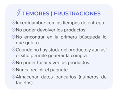
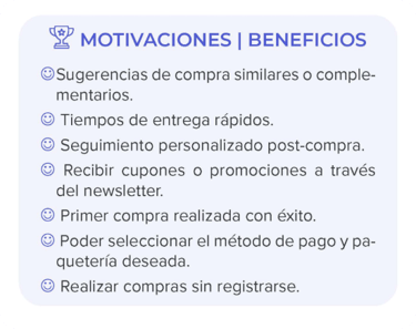
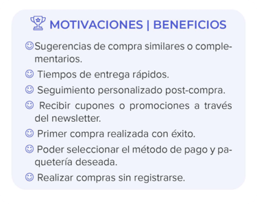
Also, during the interviews, I gather key points related to users' motivation and frustration that can be crucial for improving their online shopping experience.
Ideation: Brainstorming & Screen Flowchart.
Once I understood the users' concerns, I had to establish the new website's content structure and flow. This step was guided by the findings of the previous phases, which were essential for laying the redesign baselines.
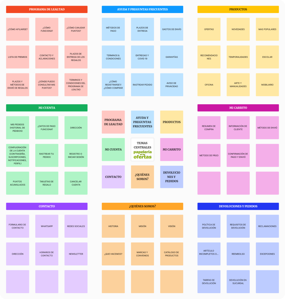
✦ Brainstormirng: Content list.
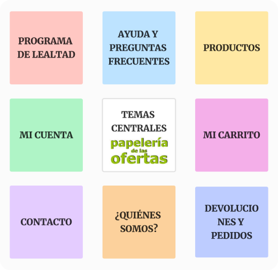
I used this tool to define the content for the website. The focus was on providing subjects that address users' and business concerns.
I included the following main subjects: My Account, My Shopping Cart, Products, Frequently Asked Questions, Returns and Orders, Loyalty Program, Contact, and Who Are We?
✦ Screen Flowchart
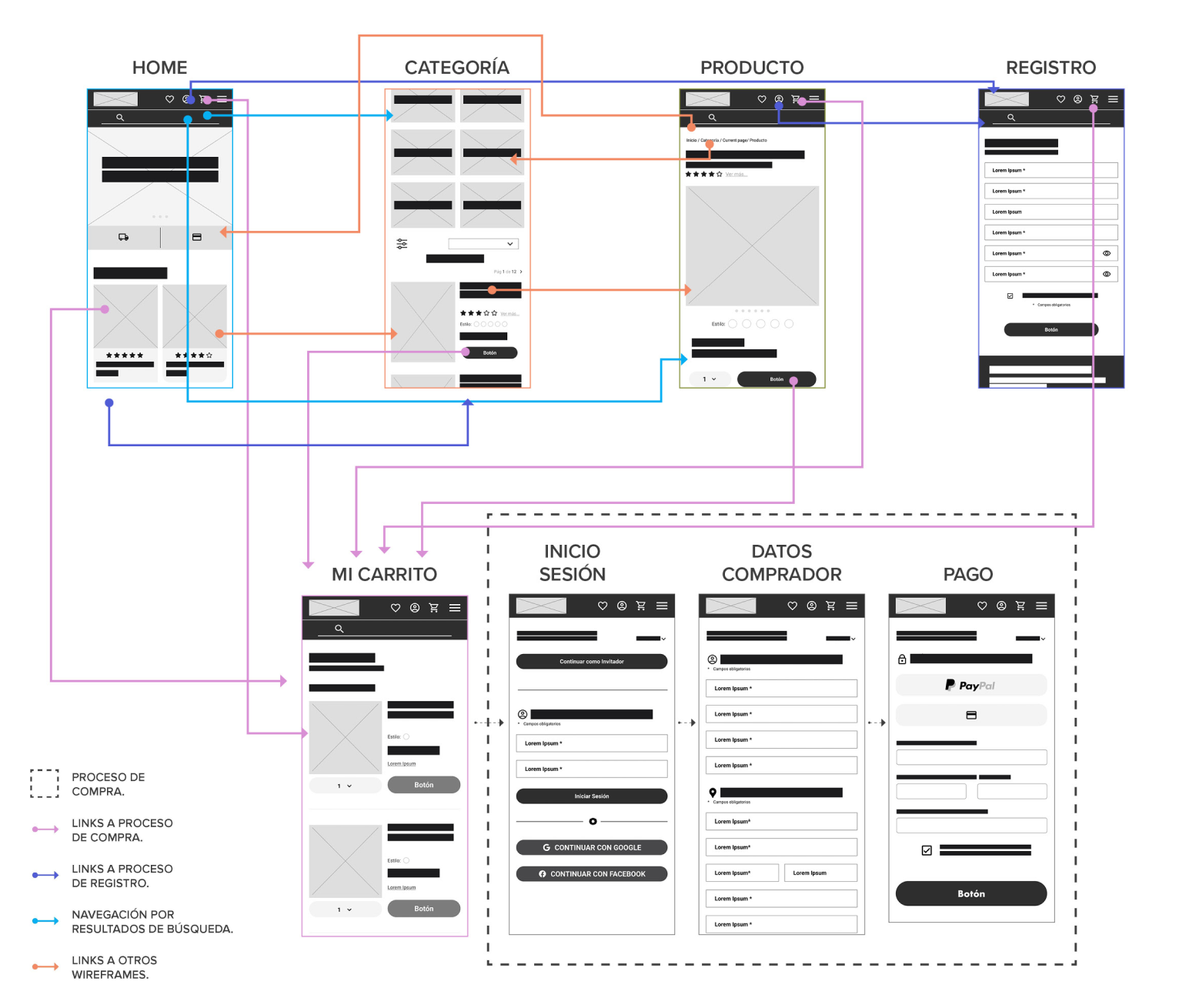
Once the content was set, I crafted a flow diagram to illustrate how the connection between screens would work for the main processes, such as shopping, registration, and searching.
Next, I explored these subjects to uncover possible subcategories that would significantly improve the website's content.


Feature 01: Improvement of design & layout.
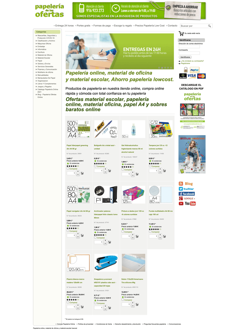
The previous layout didn't consider structure and spacing, leading to user distrust and decreased shopping.
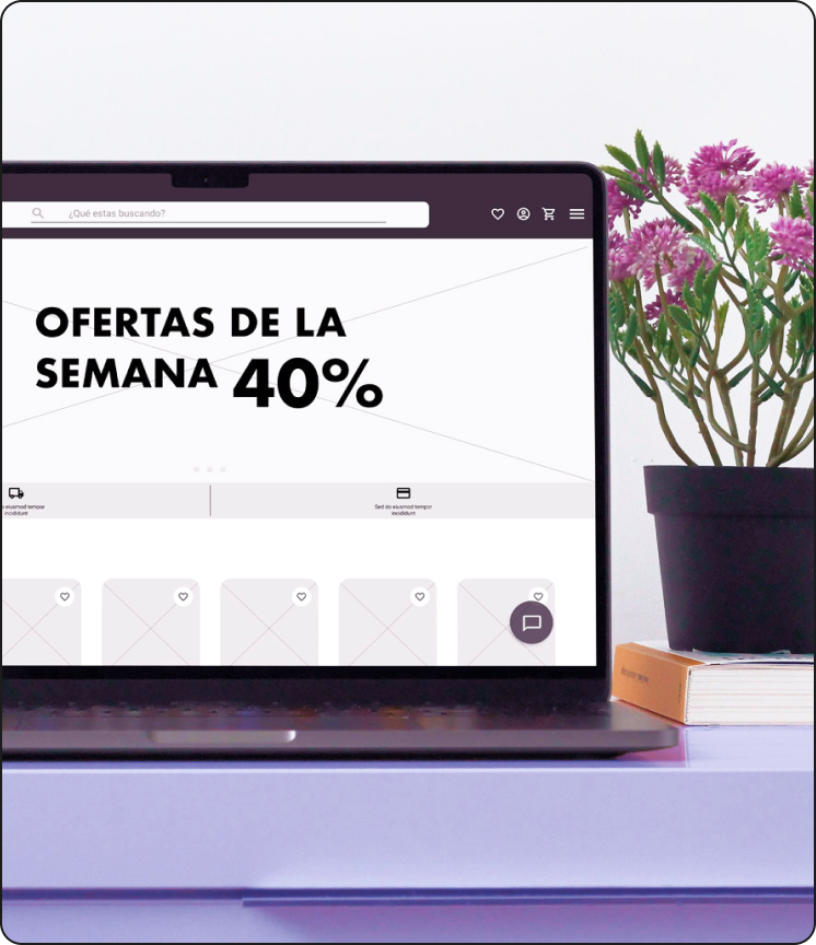
For this reason, I established a grid of twelve columns to improve the visual aesthetic and content organization based on size, position, and relevance. This grid also allows aligning elements in rows.
Home Before
Home After
(Scroll window)
Clear navigation menu for better product searching.


Images are used to improve engagement.


Content is organized in groups of 6, 3, or 4 elements per row.
Content is arranged from most relevant to least to establish a hierarchy.


Feature 02: Well-defined categories.
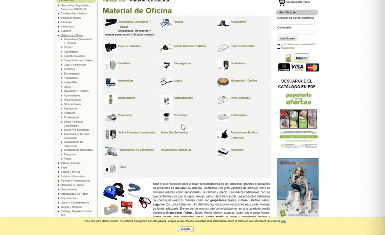
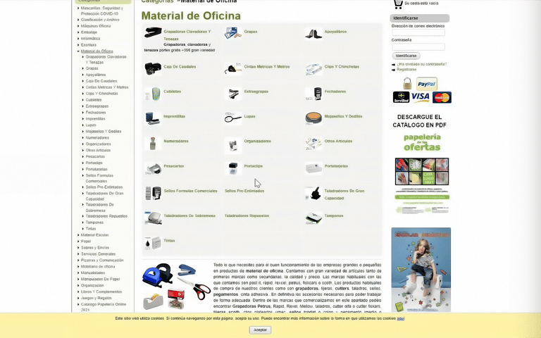
The previous categories' design was confusing, making it frustrating for users to find the desired products.
I proposed organizing products into purpose-based categories and subcategories to avoid confusion. Also, I implemented filters to provide users with more customization options.
Category Before


Category After
(Scroll window)


Access to the categories menu at any time.


Usage of images to identify a category quickly.


Products are filtered by brand, price, and color, among others.
Breadcrumb to help users locate themselves within the site.


Additionally, I organize items by other characteristics, such as brands, the most popular products, newest, temporalities, and offers.


Relevant Categories
(Scroll window)


Carrusel with popular products.


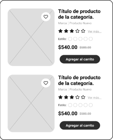
Grid list of new products and temporalities.


Carrusel with sales & offers.
Gallery with Pinterest-type inspiration board.


Feature 03: Improvement of product display.
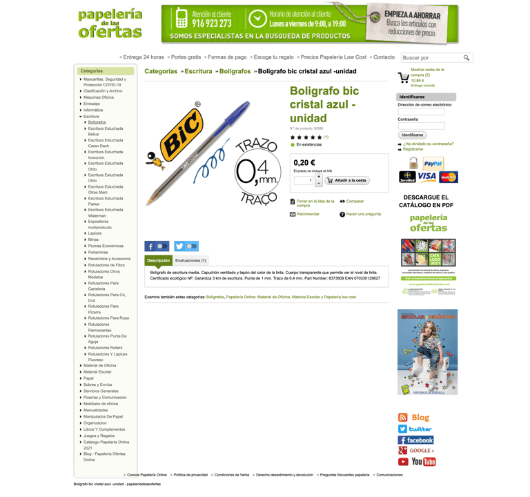
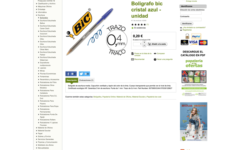
During interviews, users expressed worry about the product's reliability due to insufficient information. To tackle this, I improved the product page by adding an image gallery, detailed descriptions, transparent payment policies, and clear shipping details.
Moreover, I included a review section to display comments from previous customers. This feature is intended to boost confidence in the new customers' purchase decisions.
Product Before


Product After
(Scroll window)


Image gallery of the product.


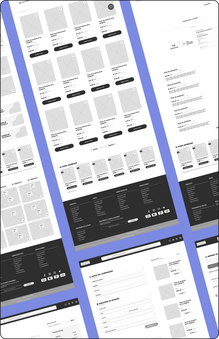
Feature 04: Upgrading the shopping process.
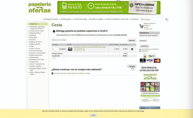
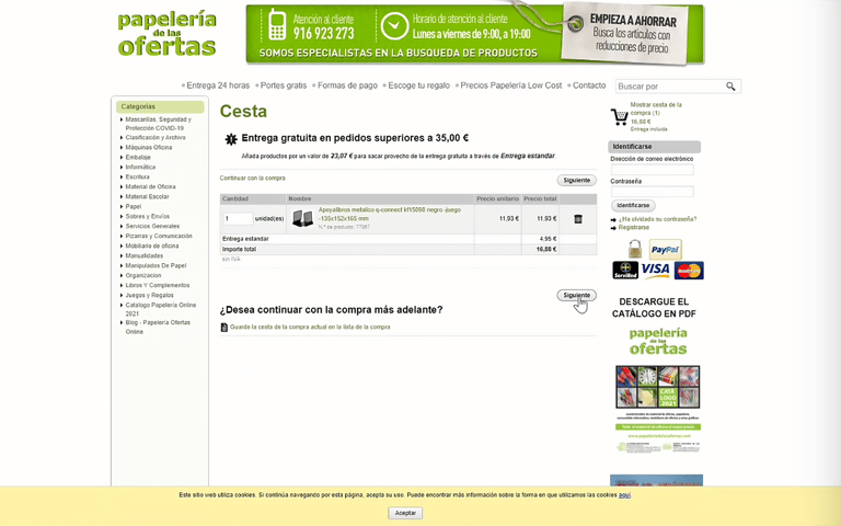
The purchasing process was complicated from the beginning. Users found difficulties with the shopping cart and couldn't easily edit, add, or delete products.
As a first step, I've redesigned the shopping cart layout to facilitate product browsing and editing. Products are on the left side, and a shopping summary is on the right for easier consulting.
Shopping Cart Before


Shopping Cart After
(Scroll window)
After upgrading the shopping cart, I focused on improving the checkout process. The previous design made the checkout experience seem lengthy and complicated. To fix this, I divided the process into three simple steps.
With these improvements, the interface can lead to a more intuitive and smooth checkout process, resulting in a more pleasant shopping experience.
Checkout Process Before


Checkout Process: Log in
(Scroll window)
Checkout as a guest or log in with an email or a social media account.


Checkout Process: Shipping & Billing
(Scroll window)


Selection of shipping method.
Text inputs for the buyer's information and address.


Checkout Process: Payment
(Scroll window)


Payment methods includes credit/debit cards or PayPal.

